Before you dive in
We've made some big changes both visually and under the hood for this release. If you rely on any third party plugins or themes, we highly encourage you to check for updates before delving into Obsidian 1.0.
- Settings → Appearance → Check for Updates.
- Settings → Community plugins → Check for Updates.
This update includes significant changes to the look and feel of Obsidian. Some of the highlights include:
- Tabs – The workspace now supports tabs. To accommodate tabs, we've made a lot of tweaks to Obsidian behaviors.
- Tab stacks – an alternative way to view your tabs, reminiscent of Andy Matuschak's website.
- New appearance settings – Obsidian has gone through an extensive redesign process to make the interface more robust, accessible, and easier to tinker with.
- Tons of other misc. improvements – New 'fold' commands, an overhauled Theme Gallery, and bug fixes galore!
Make sure to take a look at the FAQ section which should address some common points of confusion as you adapt to the new Obsidian.
Tabs
With this update, we have embraced tabs throughout the UI. We've found that tabs provide a more intuitive experience for both browsing and editing notes in your vault.
Tabs have had us rethinking some of the most basic interactions with Obsidian. We have taken this opportunity to consolidate the hotkeys for opening files. Combine these modifier keys when clicking on any link in Obsidian (this includes the quick switcher!) or use them with Enter to navigate the link under the cursor.
| Action | MacOS | Windows/Linux |
|---|---|---|
| Navigate | None | None |
| New Tab | ⌘ (+ Shift in Source Mode) | Ctrl (+ Shift in Source Mode) |
| New Tab Group | ⌘⌥ | CtrlAlt |
| New Window | ⌘⌥Shift | CtrlAltShift |
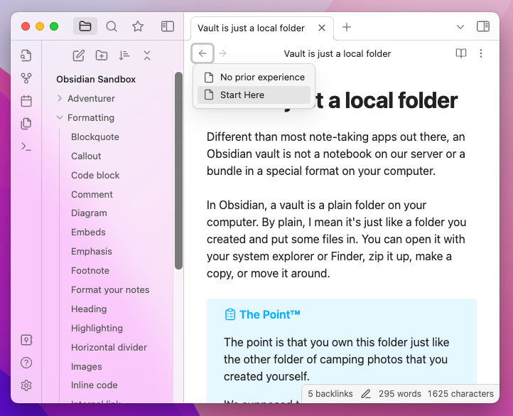
Tabs have also inspired some changes to how users browse their vaults. It felt only natural that we also introduce per-tab history. Each tab now maintains its own history for navigation.

Tab stacks
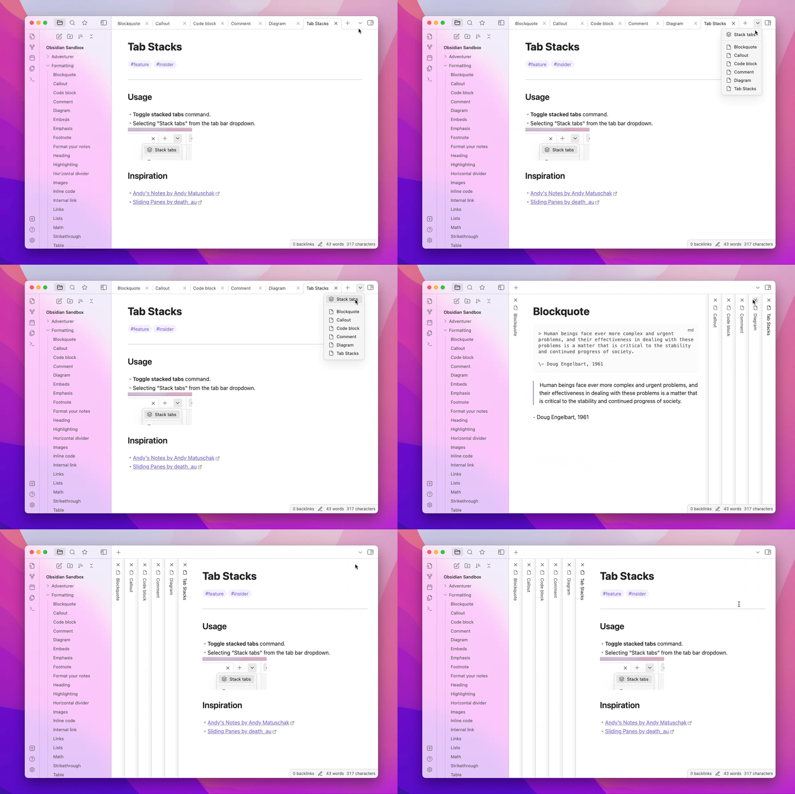
You can now switch any tab group in your workspace into a tab stack. Tab stacks provide an alternative way to view your tabs, reminiscent of Andy's Mode.

Tab stacks are, at their heart, the same as a tab group. Try mixing and matching with a tab group on one side and a tab stack on the other.
New appearance settings
We've introduced quite a few new settings at Settings → Appearance.
| Setting | Description |
|---|---|
| Show inline title | Notes now display the full note title inline with the note contents as an Inline Title. You can disable this in settings |
| Show tab title bar | Show or hide the title bar at the top of very tab. |
| Window frame style | By default, the UI is now in Frameless mode. The window title is hidden. In settings, you can choose between the new frameless mode, the custom Obsidian frame (old default), and using the native OS window frame. |
| Accent color | There's now an "accent color" color-picker to give your vault its own unique style. Theme support may vary. |
| Zoom level | Controls the overall zoom level of the app. |
| Native menus | Menus will be rendered to match the context menus provided by the operating system. Enabled by default on MacOS. |
Additional improvements
- The Theme Gallery has gotten a major overhaul. Themes now support versioning just like plugins. Note: Themes that are not compatible with 1.0 have been marked as "legacy" and cannot be installed until they get updated.
- Added "collapse all" button to file explorer and tag view.
- Added "Fold more" and "Fold less" commands for folding lines under the cursor.
- Added "Change theme" command for quickly switching between themes.
- Auto-generated links to headings now keep more punctuation characters for better contexts.
- Added "Find & Replace," Export PDF, Share, and text formatting items to macOS app menu.
- Added
Shift + Up/Downhotkeys to expand search results while a search item is focused. - Renamed "Split vertically" and "Split horizontally" to "Split right" and "Split down" to avoid ambiguity.
- Pressing
Homewill now move the cursor to the beginning of a list item. - Obsidian Sync: The history view has a toggle to choose between seeing the version of a file at a point in time or seeing the diff.
- Release notes will now automatically show after Obsidian updates.
- Improved community theme/plugin README.md relative images, added support for videos.
- Renamed "active file" to "current file" in several commands for better consistency.
- Improved the overall appearance of the app when "translucent window" is enabled.
- Soft-wrapping of lines should now better avoid misaligned indents.
- Added an option to Export to PDF to show the name of the note at the beginning of the document.
- Publish: "new" and "unchanged" sections are now collapsed by default.
- Fixed bug with search results containing "path:" sometimes showing duplicate text.
- Fixed multi-line embedded queries not working.
- Fix memory leak with loading native system fonts.
- Fixed crash when file explorer is missing a sort order.
Ctrl/Cmd+Wcan now close the vault switcher and help window.- File explorer keyboard navigation properly ignores hidden files.
- Clicking to edit Live Preview widgets (e.g. tables or callouts) will now scroll the view to the beginning of the widget.
- Word count now works for any text file that can be opened, not just
mdfiles. - macOS: "obsidian" will now be capitalized in the App menu.
- macOS: commands will no longer refer to Finder as "System Explorer."
- macOS: right-clicking on top of the cursor will no longer cause the word under the cursor to be selected.
- Added
show-themeaction to the Obsidian URI. It will open the given theme in the Community theme gallery. For example: obsidian://show-theme?name=Minimal
For Developers
- Workspace information is no longer saved to the
.obsidian/workspacefile. It is now saved toworkspace.json. - Added standard color picker component.
- Added
has-active-menuclass to file explorer item that received the right-click. - Added
list-bulletclass to HTML markup for unordered list items. - Theme developers: we have published a guide for helping get your theme ready for 1.0.
FAQ
Q. Why am I seeing the title of my note duplicated at the top of my note?
We now display the filename as an Inline Title to allow filenames to feel more attached to the note. If you already have the heading of your note matching the filename, you might notice some redundancy. You can disable this feature via Appearance → Show inline title.
Q. Why does everything look so big/small?
The new update has made some changes to make Obsidian feel more native to your operating system. To adjust the overall scale of the UI, you can configure the UI Zoom level in Settings at Appearance → Advanced → Zoom level.
Q. How do I open notes side-by-side now?
The behavior of
Cmd/Ctrl + EnterandCmd/Ctrl + Clickhave changed to opening links in a new tab. To open links in a new pane to the right, you can useCmd/Ctrl + Alt + EnterorCmd/Ctrl + Alt + Click.
Q. Why can't I toggle checkboxes with CtrlEnter (or ⌘Enter on MacOS) anymore?
The default hotkey for "Toggle checkbox status" has been changed to CtrlL (or ⌘L on MacOS). CtrlEnter is now the default hotkey for opening links under the cursor in a new tab. You can change these hotkeys in settings.